How to pick a font (that doesn't suck)
A quick guide on how not to screw up choosing a font (for non-designers)
👋 Good morning from Los Angeles! I'm Nate Kadlac, and this is #142 of Plan Your Next. A Sunday newsletter that connects design, creativity, and how you prepare for your next thing.
💡 What’s new?
🎨 I’ve been writing about how to approach design. Not coincidentally, I teach a two-day workshop designed to help non-designers like you make better decisions for their own projects and businesses.
My next cohort is on the weekend of Feb 25-26, and these past few issues are a snippet of what you'll learn. Get on the waitlist!
📸 Crossed one million views of my photography on Unsplash. Wild. Feel free to use my photos anywhere. (But I’d prefer if you learn to draw your own.)
How to pick a font that doesn't suck (for non-designers)
Have you ever been told choosing a font is a waste of time? Or there are more important things to do than spend time worrying about which font you use?
If you know nothing about typefaces, you might be right.
Because for the non-designer, this process could take hours that could be better used on your business.
So you have three options:
Spend zero hours picking the same default font everyone else uses, which also happens to be the fonts Microsoft, Apple, or Google tell you to use.
Search for hours looking at fonts not knowing what works—or God forbid—having to learn about typography in the first place.
Hire a designer. (But we all know you’re not going to hire a designer if you can't communicate what you want—more on that below)
And this is the eternal decision loop you find yourself in! Design gets put on the back burner and you end up making the same design decisions as everyone else around the web.
What if there were a few simple rules you could follow, so you could still find a good font for your projects, without having to spend hours learning design?
Knowing all of this, it should be my duty to make the web a more readable place. I’m doing this for me, not you.
But you’ll benefit too.
Tip #1: Pick one type family with 6+ styles
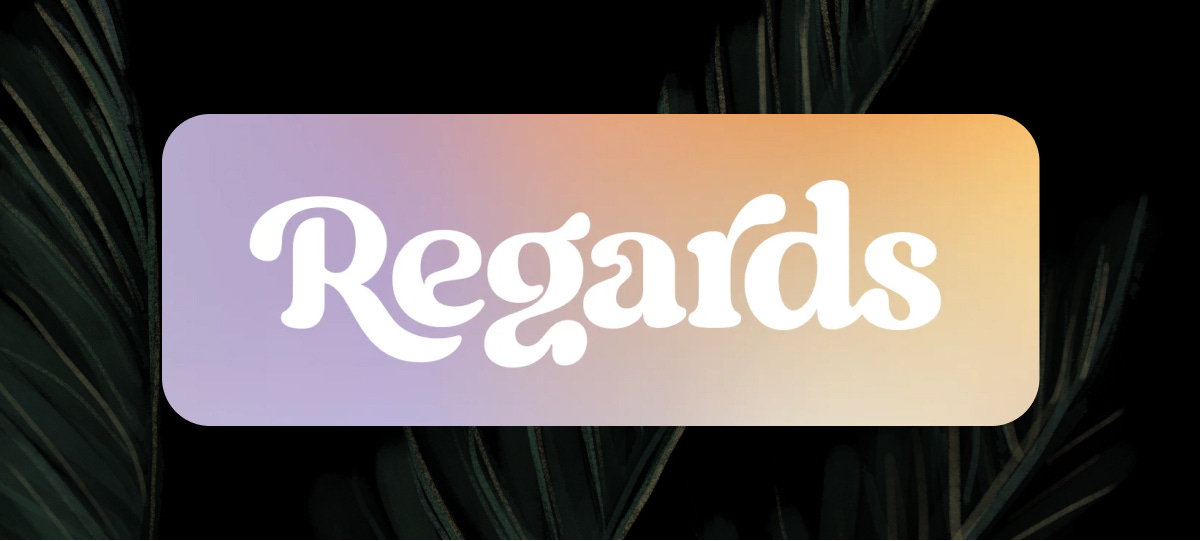
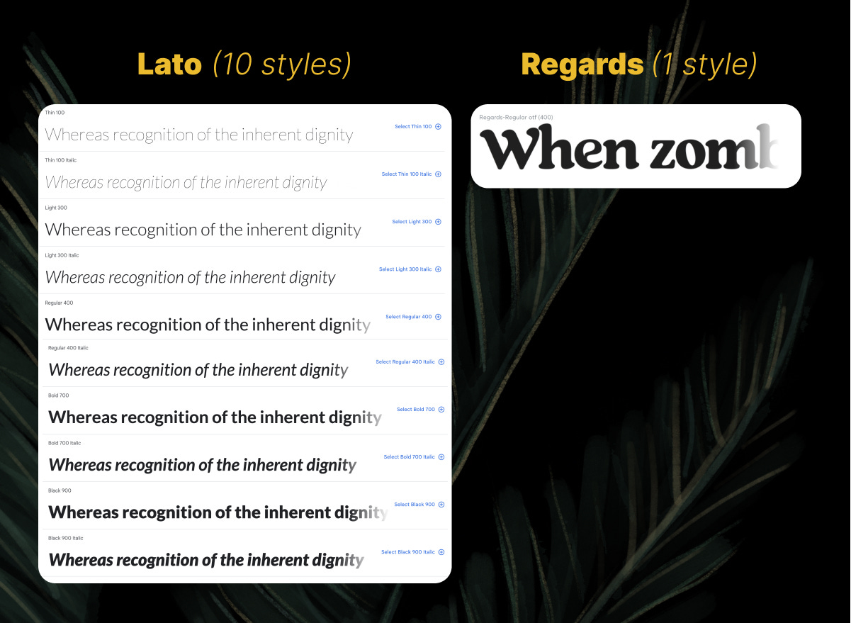
The worst thing you can do is pick a font that has 1 style, like this one.
A ‘style’ is like bold, semi-bold, regular, or italics.
Regards is a good-looking font, but imagine trying to use it for everything.
Headers, subheads, body text, captions, buttons, etc. Nope. Not going to work! All you can do with it is scale it up or down.
And so you just wasted $19 when you figure out you realize it won't work for everything.
If you're going to only pick one typeface for everything, pick one that has 5+ styles.
Like Lato for instance.
Lato has 10 styles, so you can use it for anything and everything. Billboards, websites, social media, paid advertising, face tattoos, mugs... the list is endless.
Once you have a flexible font like this, start playing with sizing and creating contrast using the different weights and sizes.
Want to see the styles of fonts you already have access to? Click on the name of a font in a dropdown like Google Docs, and see if there are any variations like this.
Tip: In Google Fonts, you can filter fonts by style. And anything you find on Google Fonts is free to use both personally and commercially.
Tip #2: Combine fonts with one superfamily
There are over 200,000 fonts to choose from online, but you should only pick one or two to use in your designs.
Sound difficult? It’s not if you don’t plan to spend money on them. Your best bet is to head to Google Fonts and pick a superfamily.
A what?
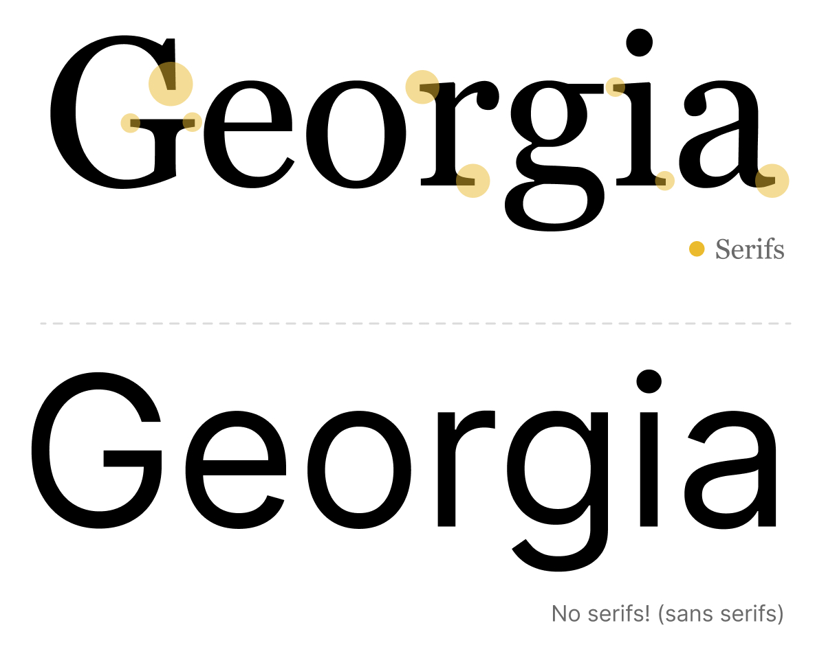
A superfamily is one where the exact same designer has created a serif and a sans-serif version, so you know they'll work together. Mix and match them in any way you can imagine, and they’ll work well together.
Using serif and sans-serif fonts instantly creates visual intrigue due to their contrast.
Thankfully Google has a few of these, which you can use for FREE. Download a pair of these and you’ll never need to choose another font again.
Note: Never pair two different sans-serif or serif fonts together. (Like Helvetica and Arial) They’re too similar to each other, and it just looks amateurish.
Pro tip: Combine fonts by picking a different font for your header and body text
Let's say you don't want to pick a superfamily. You want to head out on your own into the hundreds of thousands of fonts and find something completely unique. You should!
My recommendation is to first pick your body text font, then go find a header font.
But, don't pick two different serif fonts or two different sans-serif fonts.
If your body text font is a serif font, go find a sans-serif header font.
Body Text fonts
Body text fonts are your workhorse. They do 95% of the work on your newsletter, article, and web pages.
You'll want to pick one that has 5+ styles so it gives you a lot of flexibility. So, follow Tip #1 for choosing a body text font.
Header fonts
Where you can get more expressive is by choosing a unique header font. Since you already have a flexible body text font, you can find a header font with 3+ styles. It's a little more limiting, but you don't need to use it all the time.
But unlike the font Regards, we need a little flexibility. At least 3+ styles are enough to work with.
If you have never visited a font foundry (an online design shop that sells fonts), I made a quick video here detailing how to find and pick a font to use from a small boutique shop, by Dan Cederholm.
Stand out with your own visual style
If you have ever been overwhelmed with making your own design decisions or working with designers, I’ve got a two-day workshop to help you unlock your visual style.
It’s for non-designers, so even if you don’t know what colors to choose, we’ll help you during our live course. (And bonus, you’ll learn how to use Figma to create your own assets)
Our eighth(!) cohort is coming up on Feb 25-26. Enrollment opens soon, and you can get on the waitlist here.
⚡️ Your next creative hit
🍄 Mushrooms need a PR campaign, and it’s here.
Incredible writing and creative storytelling in this half-baked ad. (h/t Noah Stokes)
🍳 I’ve fallen in love with these carbon steel cooking skillets
Honestly, I’ve never known cooking skillets could look so damn good.
👋 See you next Sunday
My calendar is always open to chat about your next adventure, crazy idea, or if you’re feeling creatively stuck.
My goal is to help more people give a damn about what they’re creating next, through my writing, teaching, and design. If you want to support my journey, the best ways are to learn to draw, make better design decisions, communicate stories with better slide decks or discover your visual style in my live workshops.
Or, if you want to sponsor this newsletter, sign up here.
Have a great week,
p.s. Words are just words, but if these words made you feel something, would you let me know by tapping on the heart below?


I am the founder of the Mycelium Network community and the mushroom ad was priceless 😁 Thank you for the wonderful article and sharing the video. 🍄
Wow, I’ve been doing it wrong for years. Love this advice, thank you for sharing!