What's behind a slide deck presentation that doesn't put your audience to sleep?
Plan Your Next #133
👋 Good morning from Los Angeles! I'm Nate Kadlac, and this is #133 of Plan Your Next. A Sunday newsletter that connects design, creativity, and how you prepare for your next thing.
💡 What’s new?
🎨 My live workshop—Approachable Design 7(!)—will teach you design fundamentals by building a personalized design kit. The next workshop is the weekend of Dec 3/4. If you want to get on the waitlist, you can do that here.
This week’s sponsor has grown on me over the past few weeks. Admittedly, they sent me a lamp to play with, and I’ve been using this to shoot videos even in their raw form. But, if you’re a creator shooting your creative work, this lamp does it all and looks good doing it.
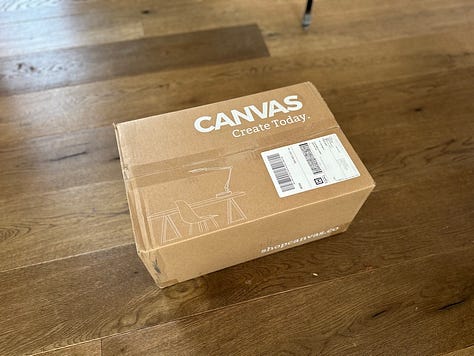
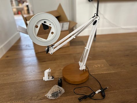
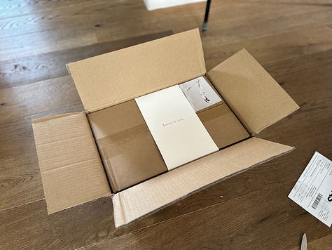
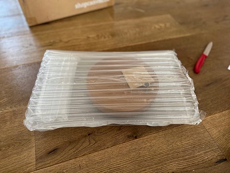
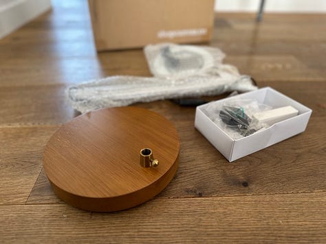
It’s just a lamp. What’s the big deal?
There’s a reason people get obsessed with Canvas. Several actually. The circle lamp is well made, stable, nice to look at, and easy to use with your phone. Want perfect lighting in every video?
What's behind a slide deck presentation that doesn't put your audience to sleep?
Slide decks get a bad rap. One of the best keynote presenters of our time relied heavily on a curated slide deck when communicating details about a device that changed the world.
Intellectually, most people know what a good slide deck should and shouldn’t contain.
A big idea. A story. Few words and fewer paragraphs of text. No cheap stock photography. No clip art. Insights. Takeaways. Action items. Visuals to communicate complex ideas. All in a package that doesn’t resemble a Powerpoint template from the 90s.
But when you’re getting ready to present in a few hours, you’re staring at a deck of 50+ slides, because how else can you fit all of your thoughts into one deck? You know better, but you’re not sure where to start.
You say to yourself, “well it’s not like they can get up and leave the meeting,” so you stuff a few more paragraphs in just so they know you did a bunch of work.
The pressure to perform and articulate your ideas turns the slide deck from a simple and powerful storytelling machine into a crutch jammed into your right armpit, barely keeping you upright.
How should you prepare to build an effective slide deck?
Now, on the flip side, many of us are professional viewers of slide decks. And if I know you as well as I think I know you, you have sat through hundreds of uninspiring presentations. (Like me)
Remember the time when you saw the presenter fumbling through the deck and jostling between editing and presenter mode, revealing dozens of slides remaining? A tiny knot formed deep inside your stomach lining. Half of it was due to the thought that you’d have to pretend to look interested for another 45 minutes, and the other half was the pity you felt for them.
Building a slide deck can give us blinders. With all of the work we put into them, the audience has to pay attention! They can’t leave the room, and so these large paragraphs of text will just have to stay. They’ll survive.
I know you know this is a nutty way to approach the time of your colleagues, your clients, or your investors.
I’ve designed and built dozens of decks over the years. An investor once told me, “That series B fundraising deck is still to date the best I've ever seen. It should win awards.”
So here are a few tips I think about when designing slide decks.
Do you even need a slide deck?
This might seem like a trivial first step, but it’s worth thinking through.
At a minimum, showing slides will undoubtedly distract from your presentation. It’s just another thing to look at, and it becomes the center of attention like a flat TV hung just feet from the ceiling on a living room wall. (Don’t do this)
If you can give your presentation in one go without support—especially if it’s a first-person story—then by all means, avoid using slides. Stick to storytelling principles, and use a method like the three-act structure to tell your incredible story. A great book on telling stories is Storyworthy by Matthew Dicks.
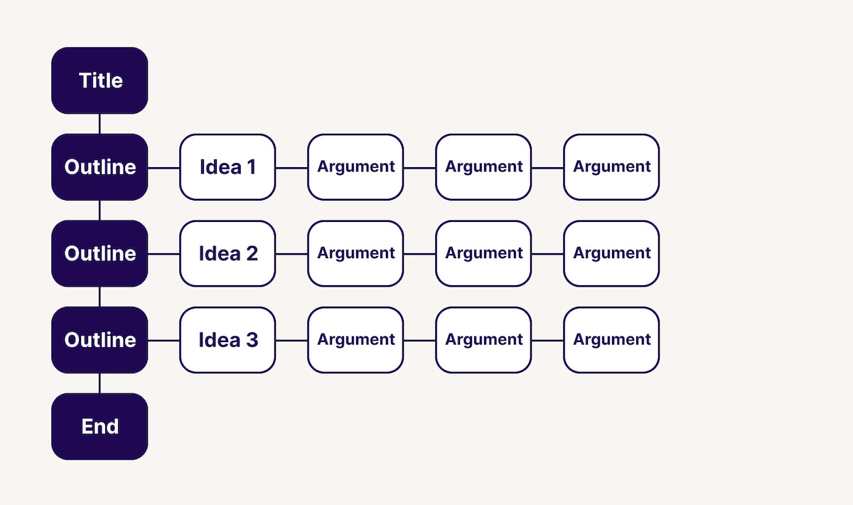
Write out the titles of your slides
Most people will read only the title of a slide. So the title should be the takeaway or the insight you want someone to walk away with. Don’t get too cute by burying the lede in a wall of unreadable text.
To help, it’s a good idea to focus on the flow of the deck. What’s the main idea behind your presentation? Use that for your first slide.
But while you’re doing this, stay in a text editor and avoid opening up your favorite software. Opening Keynote, Powerpoint, or anything else will force you to think about layout and design. Ignore this intuition, and focus on writing your titles in a bulleted list.
Paul Millerd describes his process, which includes viewing the deck in outline mode, helping him organize the flow using titles.
One idea, one slide
By writing your ideas out, you’re avoiding thinking about the content of each slide. As soon as we start thinking about content to include, our decks blow up in a bad way.
Keep it simple. Outlining precisely what the presentation is covering with one slide per idea, gives us a path to creating a much more decisive approach.
By being clear with your idea, you can add any supporting material to back this claim up.
You’re also not wasting any time getting to the point, and your audience will most likely remember the key points.
Tom Critchlow gives us some insight into how good slides reduce complexity.
Structure your slide deck like a book
No one wants to be lost. We crave knowing where we are at all times. In the middle of a 30+ slide deck, it feels like a desert.
One quick strategy I use for creating decks are to build them like books. Books are a perfect reference because of the user experience that keeps us coming back.
What are books great at?
The cover creates intrigue and hints at the story before opening it.
The size of the book tells us how much time it might take us to read it.
The inner flap humanizes it by telling us about the author and showing a portrait of them
The table of contents gives us an idea of the themes discussed in the book, or the adventure it's about to take us on.
Each chapter is a milestone, asking us to pause before we continue on
Each chapter has subheaders breaking up the ideas and stories within the book.
The back of the book gives us a summary of the content and more info about who worked on it, and testimonials of the content inside.
If you need to put together a slide deck strategy, you can use this method as well.
Cover slide with a clear title (or hook!) of the story
Table of contents
Chapter pages highlighting where you are in the deck
Slides with a single takeaway (and supporting evidence)
An end slide with how to contact you and follow-up
Avoid using a template
Look, there’s a time and a place for templates, but staring at these gives me analysis paralysis.
As a designer, there’s something so delicious about building a slide deck. The dance between presentation, vision, design, and writing comes together in one unique artifact.
But slide decks should be much more simple than you think. Unless you understand why things should animate or transition, you shouldn’t apply the default effects. Many reek of amateurism, like a badly applied blur effect on a photo.
Use visuals to simplify a complex idea
Images should inform, not act as decoration.
Sourcing stock photography is a painstaking process because you’re on a dead-end path. I’ve had numerous salespeople ask me to find a random image that acts as a metaphor to the message being given. As if an image of a magnet representing our synergetic attraction as a company is going to help you land the deal.
Stop. Images should inform, and not act as hammers hitting heads of nails.
Too much time is wasted on finding stock images that aren’t effective.
What you should do is find relevant visuals that communicate the idea more clearly, or don’t use images at all. Use graphs to simplify numbers and data. Use real images of your employees if you think it’s necessary to communicate the personal connection of your company. Use real screenshots of the work you’re doing to communicate the products making an impact at your job.
Lastly, you should use images for storytelling. If you genuinely think an image will help visualize a part of your story, full screen with that image (without text) and speak to it. The power and emotion derived from telling a story can be effective, and so using images to supplement it.
Don’t overdesign your decks
It doesn't matter what kind of slide deck presentation you're giving, you don't need to over-design your slides. This applies to all types of deck formats. A pitch deck, a strategy deck, an informational deck... these all should be using timeless design principles.
When I’m building a slide deck, I choose a blank template and choose a simple format for my colors and typography. (And don’t deviate)
Here's the simple formula:
One primary color (pick this first)
One neutral color (pick this second)
One accent color (pick this third)
Optional: A custom black for text and a custom white for reversed white text
Pick one or two fonts max. Use them for everything.
Building a great presentation requires a deep understanding of your audience. And while our ideas might be big, most presentations can be done in under 10 slides. Pitches to investors and more complex stories might take more, but by limiting your slide to one idea, you’ll avoid putting people to sleep during your talk.
Resources:
⚡️ Two creative hits for you to check out next
Don’t give your kids an allowance; teach them the power of compounding instead.
I can’t wait to do this with my daughter. I didn’t learn about compounding until High School.
What eight years of indie consulting looks like
Tom Critchlow writes about his eighth year as an indie consultant. Having just met Tom this past year, I find myself referencing his work more often than not.
“I’m kind of a weirdo - I actually enjoy client work. There are a lot of indie consultants and freelancers that I think view client work as a means to an end, but don’t enjoy the rituals, cycles and pressures of the consultant/client dynamic. Not me. I love it!”
👋 See you next Sunday
My calendar is always open to chat about your next adventure, crazy idea, or if you’re feeling creatively stuck.
My goal is to help more people give a damn about what they’re creating next, through my writing, teaching, and design. If you want to support my journey, the best ways are to make better design decisions more easily, communicate stories with better slide decks, or discover your visual style in my live workshops.
Or, if you want to sponsor this newsletter, sign up here.
Have a great week,
p.s. Words are just words, but if these words made you feel something, would you let me know by tapping on the heart below?




This is an incredibly useful and straightforward reference. Thanks for putting it together Nate!!
This is excellent Nate. Hope all is well with you and your family.