Stop calling yourself a minimalist and learn how to combine colors—Part Deux
Plan Your Next #110
👋 Good morning from Los Angeles! I'm Nate Kadlac, and this is #110 of Plan Your Next. A Sunday newsletter that connects design, creativity, and how you prepare for your next thing.
💡 What’s new this week?
😊 We hit 1,000 subscribers! A couple of years ago I bailed on this newsletter, sitting with 50 of my close friends and family (Still love you btw). The lesson? Keep truckin’, friends.
🤓 Learn the 80/20 of design in 20 days. I’ve recorded a few videos and hoping to get this all wrapped up in the next two weeks. I think it’s going to be great, and here’s a Loom video introducing the series. Can you spot the moment where I barely held my sailor’s mouth in check? Get on the list for free before it launches.
Combining colors for minimalists
In part one, you learned how to pick a timeless color from scratch. We even gave those handpicked colors names so you can reference them more easily to people you share them with. If you didn’t read that issue, I recommend reading that first.
Today, I’ll show you how to combine your base color from part one, helping you to make better color decisions. Even if you’re a self-proclaimed minimalist.
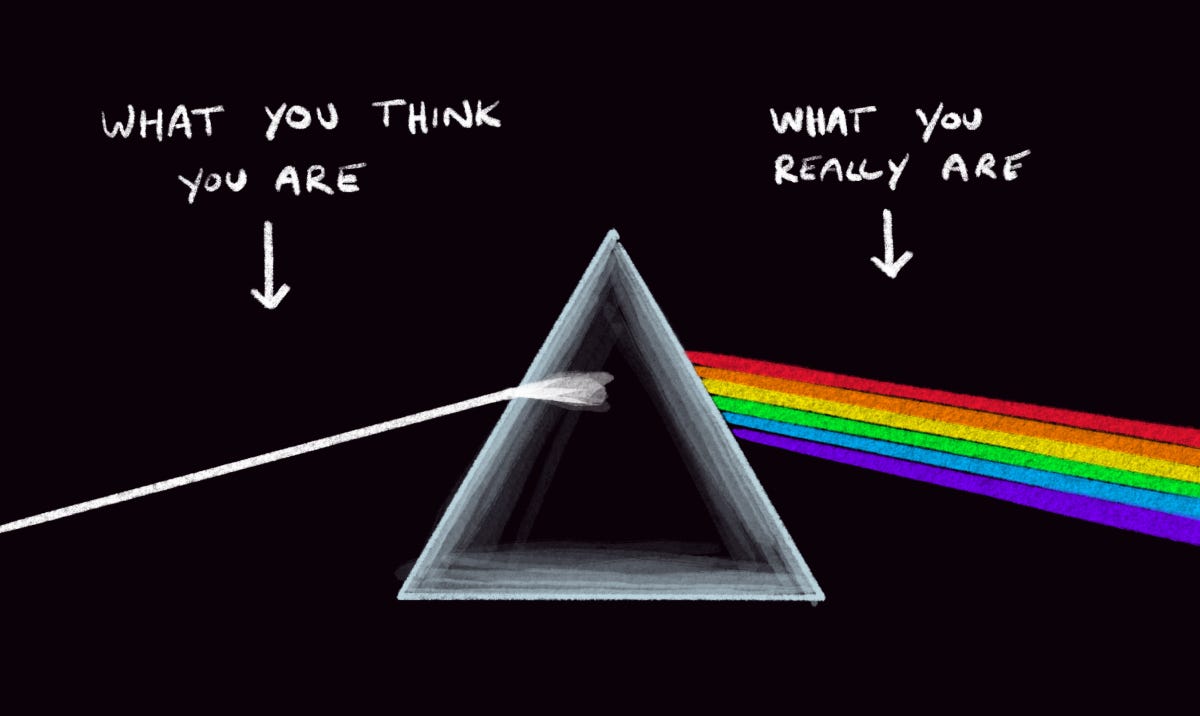
But first, I want you to imagine the rainbow. Yes, the very one that you’ll never be able to walk up to and kiss because that’s literally impossible.
A rainbow is just light being reflected off water droplets. It’s what Isaac Newton referenced when creating the OG color wheel we all have been introduced to as kids.
Funny story, he added a seventh color just for fun, because for occult reasons he thought, “There need to be seven colors to make white.” So Indigo was tossed in there on a whim.
But, Pink Floyd knows what’s up, and used the correct six colors.
Let’s think about colors from first principles
If you were to break down colors using first principles, the rainbow’s six colors—minus Newton’s Indigo—are the perfect place to start. The color wheel is based on the rainbow itself, and it shows us some very basic ways that colors can interact.
The three primary colors—red, yellow, and blue—combine to make three secondary colors—orange, green and purple. Those six colors all combine to make six more colors, and every other color imaginable. Wild!
The colors in the color wheel are considered to be in their untouched, pure state. Meaning, they are fully 100% saturated, and high-contrast. Bright as hell, and hard to work within this state.
This is where it gets tricky. While technically you could pluck colors from the wheel and mash them together, it usually won’t work because everything is at 100% saturation. They are all fighting for your attention. It’s like a bunch of toddlers screaming in unison, “Pick me! Pick me!”
So remember this: the color wheel represents the full-color spectrum where everything sits at 100% saturation.
Three core principles to color
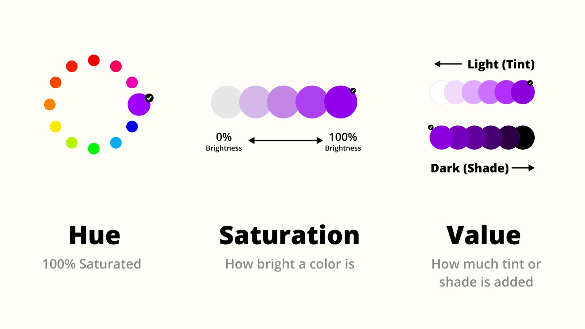
Speaking of saturation, that’s one of the principles that make up color. But first let’s talk about Hue, which happens to be the same name as one of my favorite actors. Not, Hugh Grant. The other Hugh. Wolverine Hugh.
Hue
Hues are the individual colors found in the color wheel. As pure as a glass of wine siphoned directly from an oak barrel.
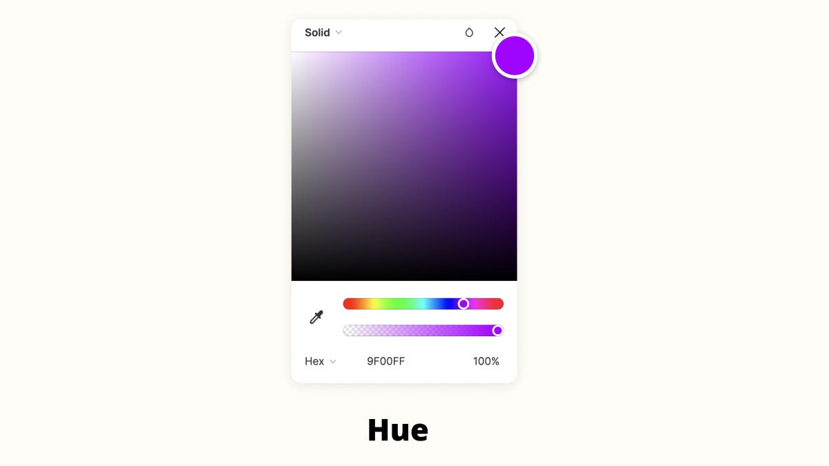
In most software that contains a color picker, you might see this resemble a horizontal line, filled with many different colors. These are hues.
Imagine a color wheel cut in half and laid out in a straight line. This is what you normally see in color-picking tools like Figma or Google Slides.
Saturation
Back to saturation. Saturation is how much intensity you see in a particular hue. The less saturation, the less colorful it becomes. 0% saturation is considered grayscale.
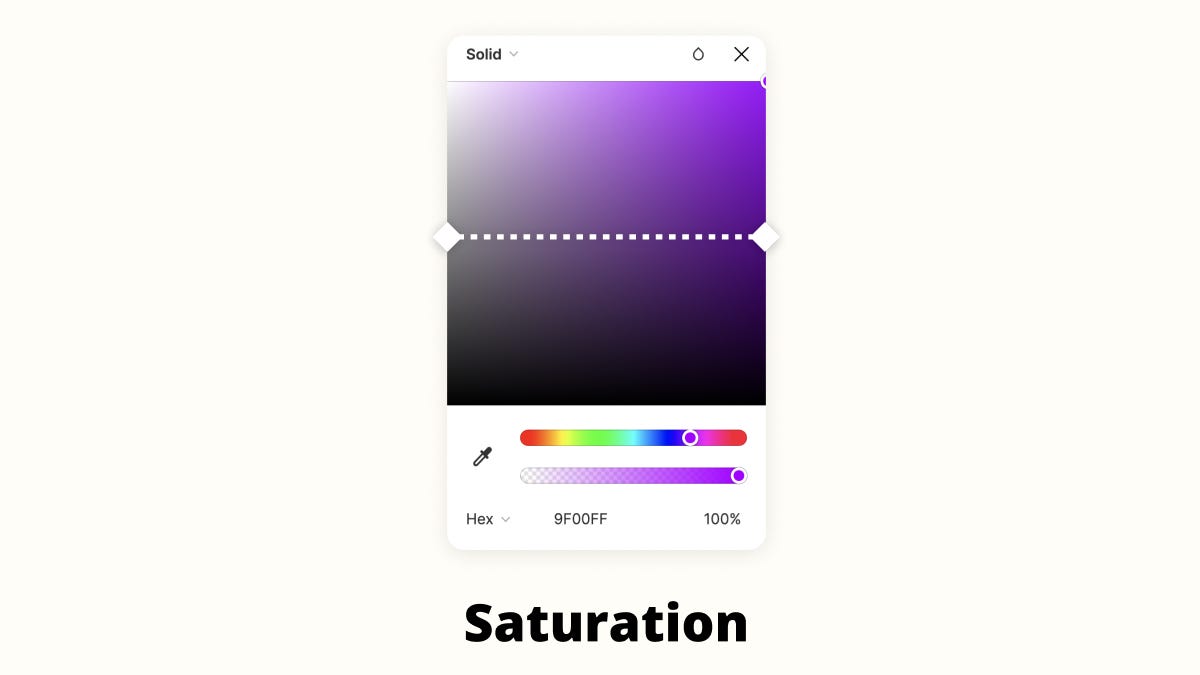
In many design tools, you might see a color picker like this.
To adjust saturation, you’ll slide the cursor horizontally from left to right. The right side is 100% saturation, while the left side is 0% saturation.
Value
The third part to color is value. Value is how much light or dark is hitting the hue itself. Also known as tint and shade.
Imagine a splotch of purple paint. 100% fully saturated purple. Now add white paint little by little to it, and it becomes 100% white over time. All of those baby steps between the purple splotch and pure white are its value.
It goes both directions though. Add black paint little by little, and you’re adding shade to it, but in the best kind of way. You’re affecting its value in the same way.
Why do these three principles matter? Because to find ways to combine colors, we need to manipulate their properties, using hue, saturation and value.
For example, since we don’t want to combine two rainbow colors fighting for attention, we need to change the properties of one or both to help them play nice.
By changing the hue, saturation, or value, you can bring peace to two colors that look like they’re about to get into a bar brawl.
Strategies to combine colors
Finding beautiful color combinations is part intuition and part theory. We spoke about intuition in part one, in how we selected our main color.
Finding color harmony between two or more colors can be easily done by using a few methods I share below.
Once you find a color combination that speaks to you, you’ll have some constraints that provide an infinite number of combinations
Monochromatic combinations
This is the easiest way to add depth to your initial color. It’s easiest to open your color inside a design tool like Figma, and select a hue. (Which is also any color on the color wheel)
Then, just drag the cursor around the square box and select another variation of that same color, either by desaturating it, or picking one that’s lighter or darker. (Tint or shade)
As long as you stay within the same hue, you can pick any variation and know it’s going to work well together.
Tip: It’s recommended to pick three variations from your base color. From the base color, I usually select a lighter tint and a darker shade to give me some flexibility.
Here are some examples of monochromatic colors:
Complementary combinations
Complementary colors are ones that sit opposite each other on the color wheel. So, take your first color and grab a color opposite of it.
These two colors will have high contrast when sitting next to each other.
Tip: Using these colors at 100% saturation is not recommended. Like a live band, you need a lead singer and a backup. One of your colors should play a backup role so it’s not competing too much with the base color.
Here are some examples of complementary color combinations:
Analogous combinations
Analogous colors sit next to each other on the color wheel. These are often easy to work with, as long as you maintain one dominant color. Use the others as accents or by adjusting the saturation and value to calm them down.
Tip: Using your main color, pick two more colors that sit next to it. Pick one as your base color, and change the saturation and value of your others to play a backup role, or limit their use.
Here are some examples of analogous color combinations:
Choosing a single color is difficult, but using a few simple principles to combine colors can add depth and personality to your websites, newsletters, and businesses.
Resources:
Figma file: My color breakdown of Stripe Press
👋 See you next Sunday
If you’ve forgotten who I am, here’s a little bit about me. As always, my calendar is open to chat about your next adventure, crazy idea, or if you’re feeling creatively stuck.
Have a great week,
p.s. If you enjoyed this letter, would you please let me know by tapping on the heart below?


This is a brilliant article. Personally, I can orgasm just looking at my Pantone book from last year but as a sneaker fiend, and fashion stylist, I’m always looking for great ways to explain color theory to clients and my dogs, but never at the same time. My dogs never require me to be naked.
Congrats on hitting 1k! Yours continues to be one of the most inspiring newsletters out there! ⚡️